SF Zoo Visual Redesign
My entry for the UX Design Contest #14.

Why I participated
As a bay area native, I loved the idea of giving our local zoo’s website a visual refresh. I have to admit I don’t often use the SF Zoo website, when I took a look I was saddened by its dated feel and accessibility issues. My goal in completing this, is to show how some visual updates can increase excitement in our zoo!
Goal
Update the visual language of the SF Zoo website to increase accessibility (WCAG 2.0) and excitement for the zoo.
Desired Outcomes
My designs will be perceived as more approachable, compelling, and trustworthy among a general audience.
Overview

Visual design decisions
Palette
First thing I noticed about the website was how busy and dated it felt. I suspected this reaction was caused by 2 factors: alignment/spacing, and colors. To start I decided to play with a new color palette.


In my visual refresh I wanted to give the website a more modern and professional appearance so I chose to use blue and dark green as primary colors as these are commonly associated with safety and trust.
Grid
To fix spacing issues I wanted to increase consistency by adding a Grid to follow.

Buttons
I noticed inconsistency with their buttons including inconsistencies with their label text, as well as the button fill. I wanted to make their CTAs more cohesive and clear so I created primary and secondary buttons as well as adjusted some button labels to be more clear as to what the action was.


Images
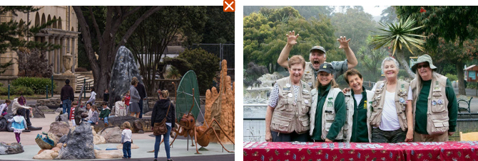
I noticed many images used on the website were quite static and/or did not have a primary focus (person or animal). In my redesign I set guidelines on what images to use:
- Images should have a primary focus (person or animal).
- Avoid images with little action and/or no animal in focus.

I also updated image cards to have better text accessibility. The current website embeds the text into their images which is not readable from a screen reader. There were also some contrast issues in areas.

Cards
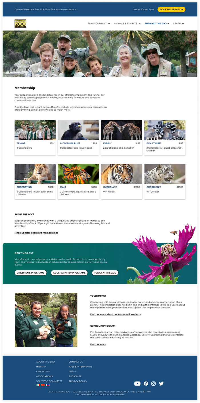
On the membership page, I noticed alignment and contrast issues with the colored cards for membership plans. I chose to update these to match other cards to keep consistent as well as add some visual elements to add interest and distinguish at a glance.


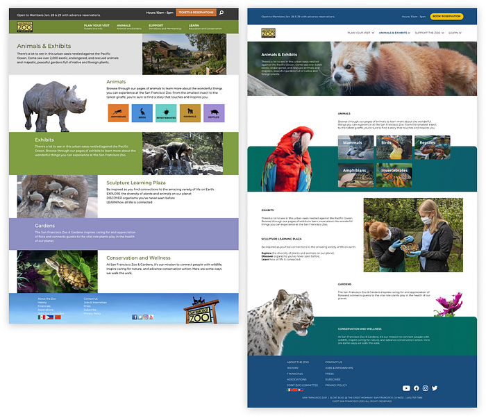
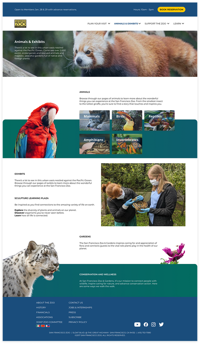
The other cards I desperately wanted to update were the animal cards on the animals & exhibits page. While there were no contrast issues there, I felt that the page was lacking the excitement for these animals. I also rearranged the order of appearance to highlight the most common favorites.


Navigation
I also wanted to update the navigation and footer to increase accessibility. The current site has some contrast issues in both the header and footer links. I simplified both the navigation and footer to bring focus to the page and increase contrast for links. See the results applied below!
Visual refresh on 3 pages
To demonstrate the updated visuals I applied the new visual language to 3 important pages: the home page, membership, and animals & exhibits. I felt these 3 pages were likely the most visited particularly when planning a trip.
Home Page

Membership Page

Animals & Exhibits Page

Results
To test my designs, I created 3 preference test questions.
• For the home page I asked participants which was more approachable.
• For the animals & exhibits page I asked which was more compelling.
• For the membership page, I asked which was more trustworthy.
My designs were clear winners for the animals (24:4) and membership pages (22:6).
Interestingly for the home page, results were tied for being more approachable (13:13). If given more time, I would love to dig more into what about that home page works, and what needs updated.
See full results on usabilityhub here.
Summary
The most challenging part of this project was getting everything done in time! If given more time, not only would I want to collect more data on the pages, I would have liked to test out the palette and branding. I chose to do a dramatic change by moving from a warm to a cool color palette, before making such a huge step I would have liked to understand the SF Zoo branding more. I could have also tested a few palettes and determined a better direction to go.
Overall I had a lot of fun on this project — it was a chance to stretch my creativity and think outside the box. I really enjoyed applying my visual guidelines to the pages and looking through the SF Zoo facebook for pictures!
Takeaways
- It’s okay to try things out, don’t limit yourself from the start. I really enjoyed updating the palette, it was perhaps unnecessary but I’m glad I was able to try out a new theme.
- Learn and iterate! I found it fascinating that my designs were preferred on 2/3 pages, but were not selected for the home page. I am curious to learn why that is and what I can improve on my designs to make it more approachable.
Thanks for reading!
